
The basic idea is to use the equations in a determinant to generate a series of X,Y values; then feed these values into a computer program capable of drawing a line given these values. The easiest way is to use a program such as Microsoft Excel, which is a spreadsheet program that has chartmaking capability.
I have made some professional looking nomograms in Adobe Acrobat format, writing a simple program in the Python language using the ReportLab library. Python is not only free, it is easy for novices to learn yet experienced programmers find it a very rapid and productive development tool.
But if you can program in Python, run, do not walk, and get a copy of the PyNomo library. This will give you the power to draw your nomograms as PDF files with a simple ten line program. And it is free as well.
Let's use Excel to draw the sample nomogram on this page. You can download the Excel spreadsheet by clicking on this link.
You should put some notes at the top, so six month from now you can figure out what this was intended to do. I have the title on row 1, the equation the nomogram solves on line 4, and the construction determinant on lines 6-9. It doesn't matter where you put them, just so the information is somewhere.
Next you should put the functional moduli in some prominent place. After you have the chart actually drawing, you can alter these values until the nomogram looks best. There is generally a delta, and a couple of mu. The example only has one mu, as it turns out. Once you put the values in the cells, select each cell and give them a name. e.g., I selected cell B10, clicked on the label "B10" in the upper left hand corner, and typed in mu. This will allow you to use the label mu in your equations instead of having to type $B$10 everywhere.
Now comes the section that draws the "h" scale of the nomogram. First is a list of h values. Each of these will make a point on the scale. I have the values 1 to 10,000 in cells A15:A30.
Second is the X coord values. These are in B15:B30. Examining the constructional determinant, you can see that the h scale's x coords are calculated by the equation -δ. So in cell B15, type in "=-delta" and hit return. Then select cell B15 and paste it into cells B16:B30.
Third are the Y coord values. These are in C15:C30. The determinant says its equation is μ * (1.22*sqrt(h)). Put the equation into cell C15.
C15 will contain: =mu*(1.22*SQRT(A15)). Select this and paste into C16:C30 (that is, all the cells in column C starting with cell 16 and ending with cell 30).
That finishes the h scale. Use the same procedure to make the R and H scales. Save the spreadsheet.
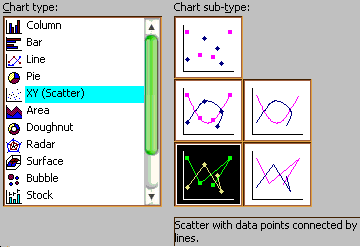
Now to draw the chart. Hit the INSERT menu and select Chart. In the left hand side of the dialog, click "XY (Scatter)", then in the right hand side click the box in the lower left corner: "Scatter with data points connected by lines". Click "Next".
In the step 2, click the "Series" tab at the top. In the next screen we will enter in the data for each of the three lines. If there is an existing Series in the list in the lower left corner, select it and click the "Remove" button.
First the "h" scale. Click the "Add" button. Click in the Name window and type: h Scale.
In the X Values window, click the little button at the right. The dialog will shrink to a single line. In the spreadsheet, select the X coord values for the h Scale, they are in cells B15 to B30. Click the little button in the dialog. It will expand and the X Values window will contain: =Sheet1!$B$15:$B$30
In the Y Values window, click its button, then select the h scale Y coord values from the spreadsheet, in cells C15 to C30. Click the little button in the dialog. The h scale is now in the chart.
Repeat this sequence to add the R and H scales.
Click the "Next>" button once, then click it again. When it asks "Place Chart", click the dot next to As A New Sheet. Then click "Finish".
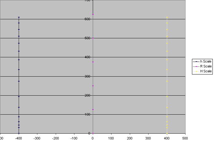
If you have done this correctly, you will wind up with something like the above.
Unfortunately, I know of no easy way to export the nomogram. The best I know is to hold the Alt key, tap the Print Screen key, open a paint program, and paste the image into a blank picture.
As a more complicated example, here is the spreadsheet that draws this nomogram.
If you want more control, you'll have to do some programming. Here is an example in the Python language that draws the grid nomogram above as an Adobe Acrobat file.
Download and install the Python language. I recommend using the free installer from Enthought. Then download and install the ReportLab toolkit and the precompiled DLLs (if you use Linux or Macintosh you will need to use a C++ compiler to make the DLLs).
Download my example program: the two files BallisticDeployMk0Mod0.py and ChartPane.py. Put these in your C:\Python23 folder (or where ever Python was installed).
If you double click on BallisticDeployMk0Mod0.py, Python will work for a bit (perhaps giving you some error message about Unicode that you can ignore) then stop. In the C:\Python23 folder should be a new file BallisticDeployMk0Mod0py.pdf, which is the desired nomogram.
My Python program is pretty crude, and is hardly an example of good programming, but it gets the job done. The reason I used Python is the power of the ReportLab library, and the fact that I wrote the nomogram program in about ten minutes. If you are really serious about doing this, get the PyNomo library.
ChartPane.py is a library of nomogram drawing functions, while BallisticDeployMk0Mod0.py is a program using ChartPane to draw the specific nomogram.
If you double click on ChartPane.py it makes an Adobe Acrobat rocket performance graph as a demonstration.