
I'm trying to figure out what to put on the side of the Strategic Space Command space station in the way of identification. I'm envisioning this station NOT as the titanic prime base around Earth, but more as a sector base. In the canon story it says
The Strategic Space Command has by the year 2075, become the single, dominant force through which man is exploring the universe. From its headquarters on Earth, SSC directs all activities in space, which it has divided up into Sectors (incredibly vast areas, covering millions of square miles). Each Sector is assigned a Galactic Expeditionary Force, whose job is to explore, open trade with friendly aliens, and establish earth colonies on new worlds. Each GEF is therefore a rather large fleet, with a wide variety of spacecraft. These include strictly military-type ships, such as light and heavy destroyers and cruisers; freighters and specialized supply ships; research, repair, and hospital ships; colony transports; etc.
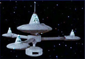
Each GEF is also assigned one Ranger Squadron, composed of four Galactic Cruisers modified for the Explorer Class. The LEIF ERICSON is this type of ship, and is a member of Ranger Squadron Omega Delta. Her sister ships in the Squadron are the VASCO DE GAMA, MARCO POLO, and JOHN GLENN.
So the station is a sector base for that sectors Galactic Expeditionary Force. I suppose the base should have something like "GEF Sector Seven", but I am fascinated by "Omega Delta". That's the designation of the ranger squadron, and suggests that the sectors might be named with Greek letters, e.g., Sector Epsilon.
Craig York suggested using Greek place names for sector designation. In Isaac Asimov future histories, sectors are named for the brightest star contained, Earth was in the Sirius sector. In Brian Aldiss' novel STARSWARM sectors are named for gemstones, e.g., Sector Diamond, Sector Topaz, Sector Sapphire, etc. And there is the standard military-speak: Sector Charlie, Sector Foxtrot, Sector Sierra.
Since these are base camps that a given Galactic Expeditionary Force establishes in their assigned sector, I favor calling the stations "Staging Bases." Craig York suggests "Watchtower", "Tower", or the German Tür e.g, Epsilon Tür, Gamma Tür, Sigma Sigma Sputnik Tür, etc. In the incredibly bad wargame BATTLE FOR ANDROMEDA, the smallest bases were unmanned automated Beacons, then came the lightly manned Outposts, and finally were the titanic armed-to-the-teeth Barrier Bastions.

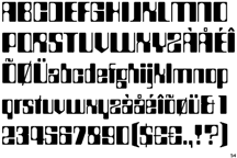
The "official" Leif Ericson type font is Ameliatm, but that conjures up memories of the movie Yellow Submarine. If you square off the rounded bits, you have a font called Countdowntm, which was used in the TV show SPACE 1999. It's not much better. For now I'm going to be a traditionalist and go with that old classic Microgrammatm bold extended.


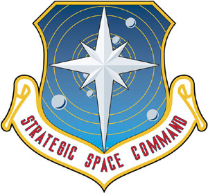
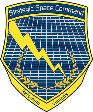
There are quite a few proposed logos for the Strategic Space Command. They have been drawn by Robert Lee Merrill of Hungry Lizard Studios (except for the first one, that was drawn by Cozmo), you can find them here and here. The general consensus was for these designs.

Captain Bob said "As to markings, is this station purely military? Any commercial or scientific space on-station? Maybe a Maersk or 3M logo on one of the outer clamshells? Would stations be divided like modern day air and sea ports? Military, commercial, civilian..."
The canon text mentions that the galactic expeditionary force is assigned a sector. They go set up a staging base there and perform their mandate: exploration, first contact with aliens, open trading relations with friendly aliens, and establish Earth colonies. And defend SSC space if they stumble over the equivalent of the Klingon Empire.
So there is an exploration/first contact/scout potential colony section. An alien trading relations/alien diplomacy/commercial/colonization section. And the defend against the Klingon/anti-pirate/police actions/military section.
Dividing it three ways is a little strained, but you see what I mean. Each could have its own "arm" of the station. The commercial arm could be plastered with corporate logos.
Now, for just the commercial traders, anywhere that several trade routes intersected would be a prime location for a trade port. Initially it could be a few obsolete bulk cargo starships lashed together. A group of traders could pool their resources to purchase a single clamshell module and have it towed into location. You can see how one module is collapsed down into a compact form for shipment. Once on location is telescope out to become a station unit. This might imply that an additional three arms could be placed on the station to make a six armed station. I added three more sockets to the hub for this.
 |
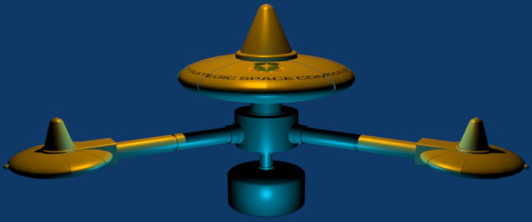
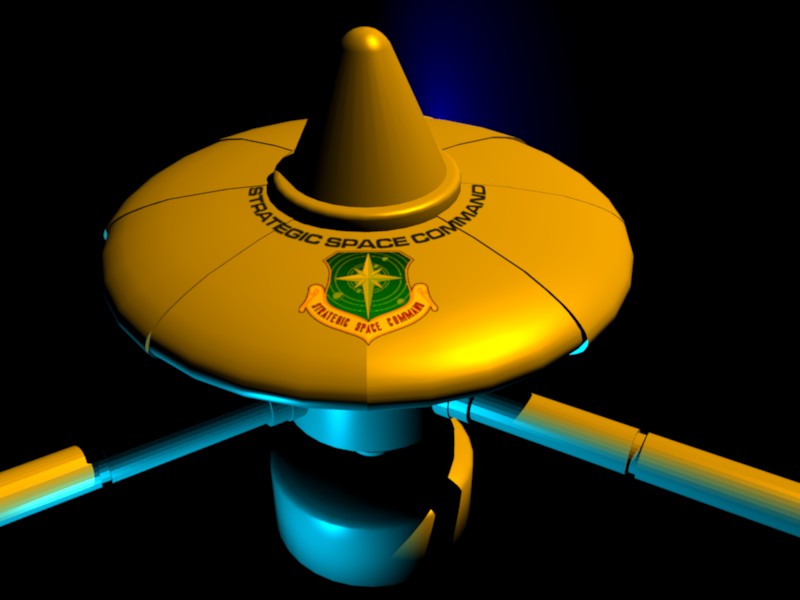
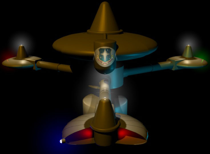
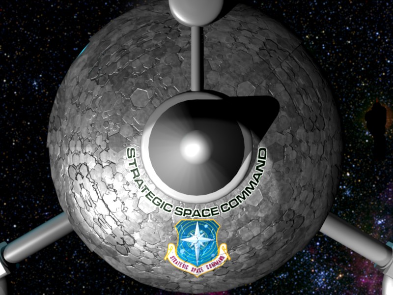
Here I am experimenting with applying the logo to the station. I quickly found out that making the text huge made the station look like a cartoon. The logo is being lit from an imaginary spotlight on the top of the yet-to-be-installed whip antenna on the center cone. Later I rediscovered the necessity of outlining text in a white border. |
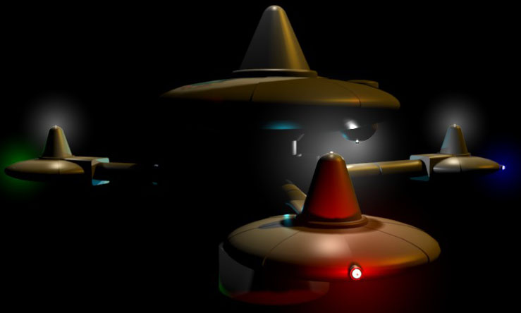 |
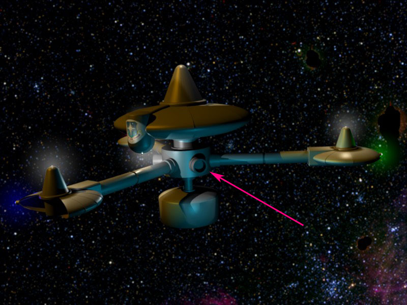
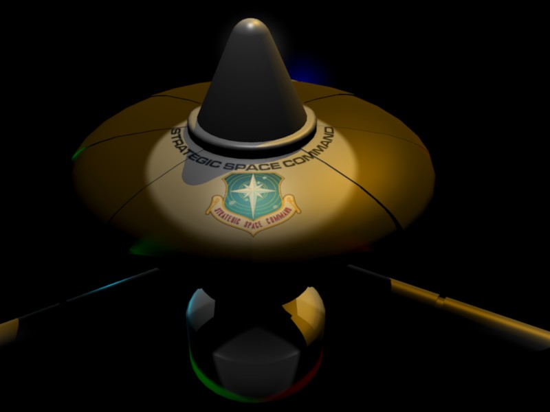
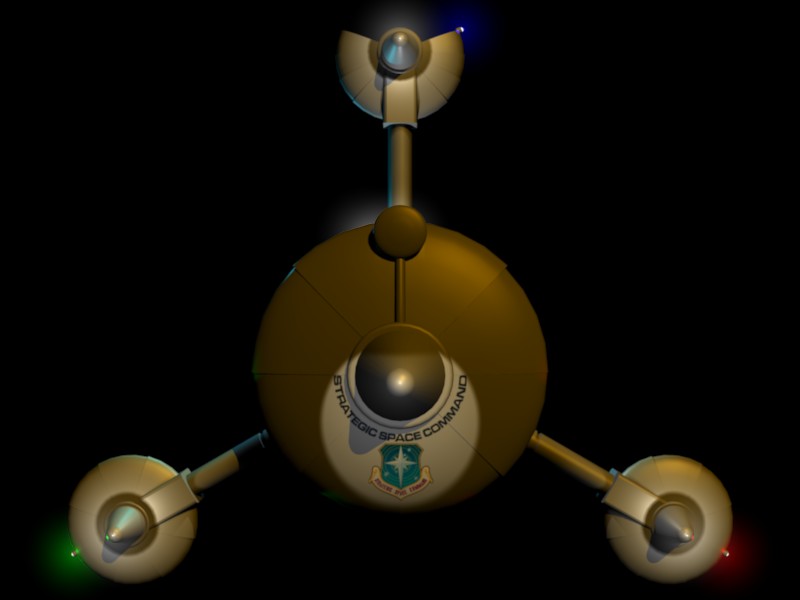
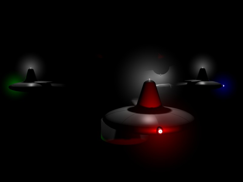
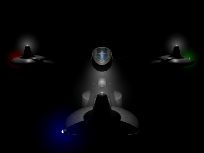
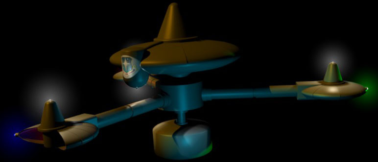
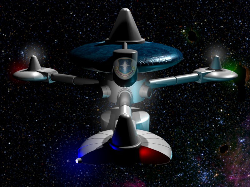
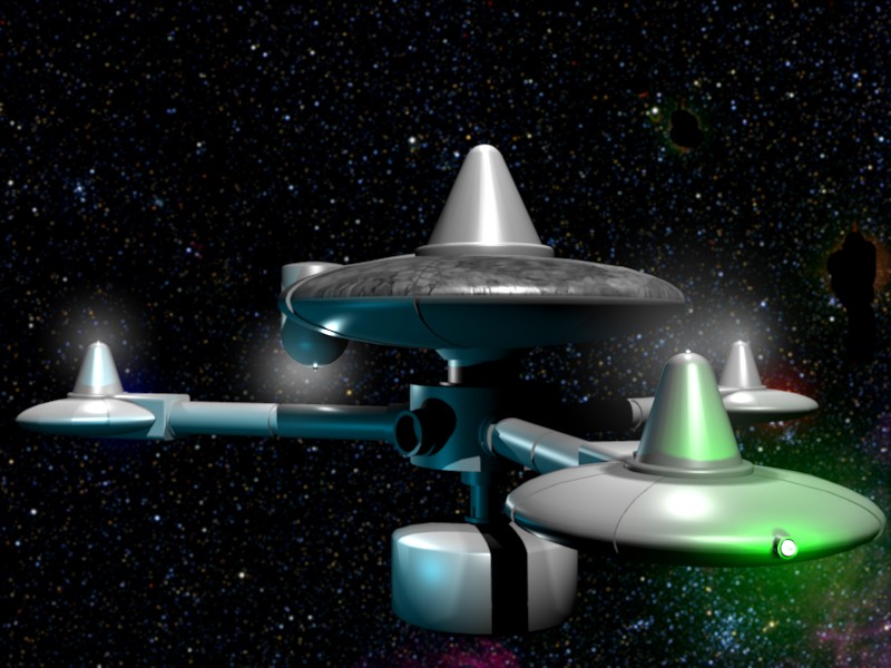
Here I am fooling around with navigational lights. I also applied a SSC logo to the cylindrial drum on the main clam shell and illuminated it with a spotlight mounted on one of the outer cones. I went a touch overboard with the light, the result looked like a garish xmas tree. I'll have to tone it down a bit. |
|
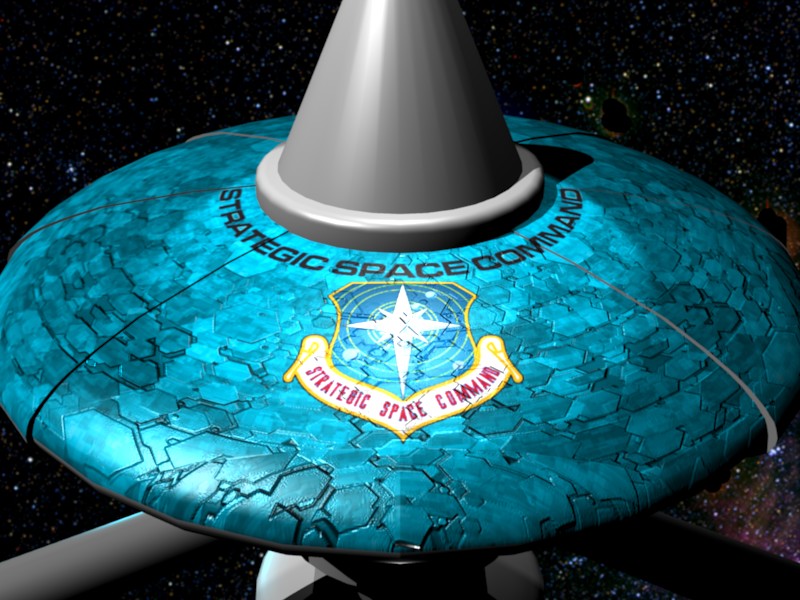
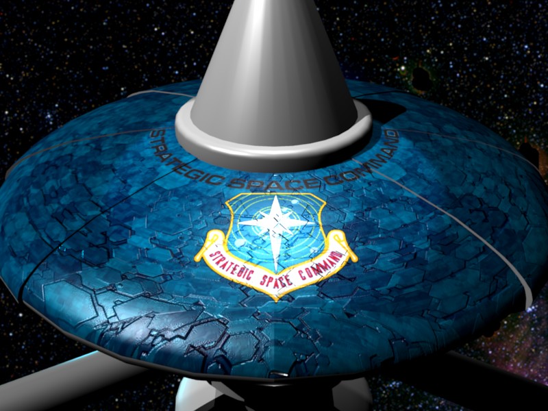
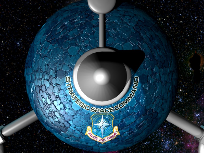
I found a set of stunning textures called "Magma SFTP - Sphericals" by Marc-Laurent Magnier. Each texture comes with four images: a -bump image to map to a Blender NOR texture (I had to use the NOR inverse), a -col image to map to a Blender COL texture, a -diff image to map to a Blender REF texture, and a -spec texture to map to a Blender SPEC texture. Texture SPanel-4 was a delightfully wierd hexagonal pattern. It was a spherical texture (i.e., it looks like a bulls-eye) which was perfect for the clam-shells on the space station. Keep in mind that I'm a novice at texturing. I like this texture because it is a new toy I'm playing with. I may decide to abandon this texture in favor of something more realistic. The -col image was grayscale, so I made a version with a blue tint just to jazz it up a little. The pattern looks like "dragon-scale armor". It suggests that the clam shells were grown like giant crystals. I thought that the blue looked a little too cyan to me and tweeked it to be a deeper blue. |
|
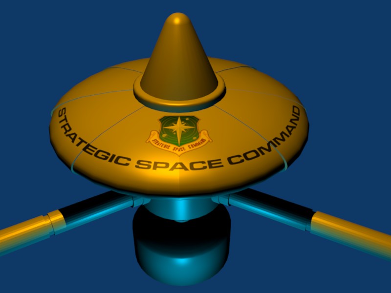
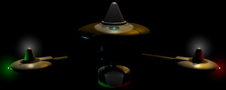
About this time I noticed that the black letters were fading into the background, so I added a white outline. |
|
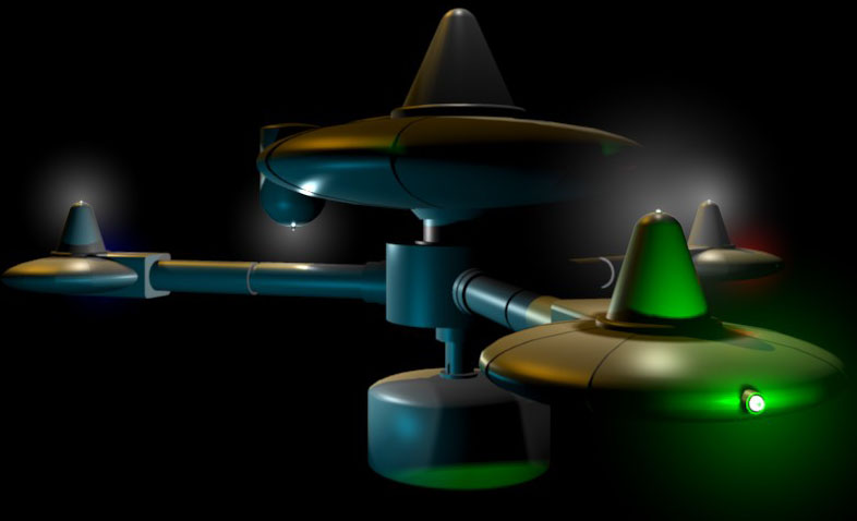
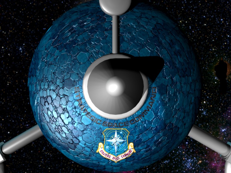
How does it look from a distance? It looks like a great dragon, but a terrible space station. It is also far too dark. That blue has got to go. |
|
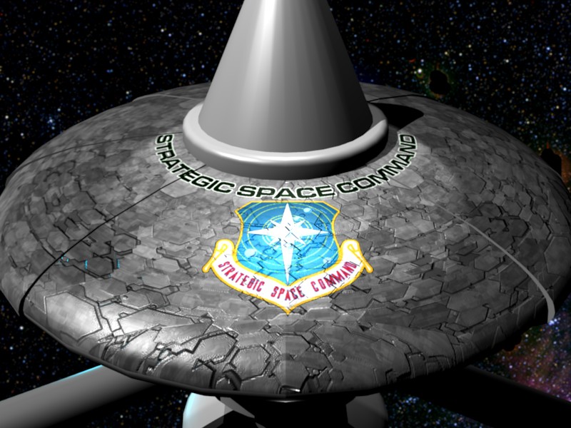
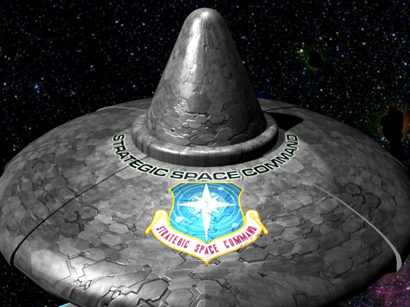
I reverted to the grayscale COL texture, it was a vast improvement. Then I noticed that the setting for the NOR texture was too high. The station looked like it had warts. So I toned it down a bit. |
|
Now it looks much better from a distance, and is light enough to stand out against the inky blackness of space. The scaly texture is a change from the standard "aztec" texture found on the saucer of the various starship Enterprises. |
|
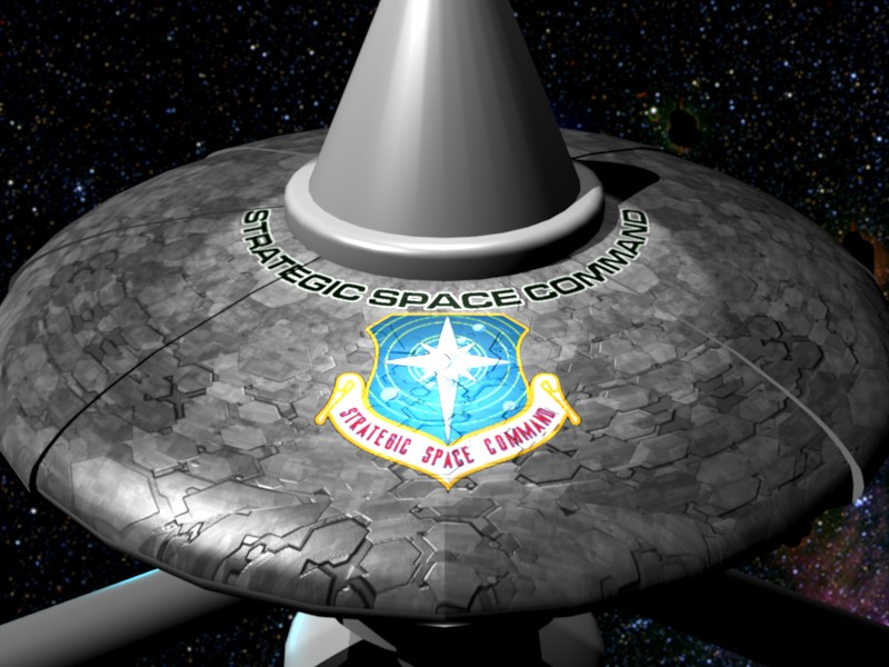
Here is a pass at applying the texture to the cone. I'll have to tone the NOR down a bit more, it still looks warty. |